Duration

Duration

2024.4-2024.6

Role

Role

UX Researcher & Designer

Involvement

Involvement

Usability Testing, Stakeholder Interviews, Website Redesign, Site Map, Content Strategies

Overview

Overview

In spring 2024, I joined UCLA's IT Service department as a Student UX Research & Design intern. With the invaluable mentorship of lead UX designer Anna Ahearn, I led the redesign of a program website, managing participant recruitment, usability testing, data analysis, and final deliverables over an exciting 12 weeks.

Unfortunately, due to UCLA’s internal priority shifts, the Ascend 2.0 project was paused indefinitely before my suggestions could be implemented. However, I presented my research findings, design suggestions, and future content guidelines to stakeholders and received positive feedback. I was also invited to present to other project teams at UCLA IT Service to inform future website designs.

About Ascend 2.0

About Ascend 2.0

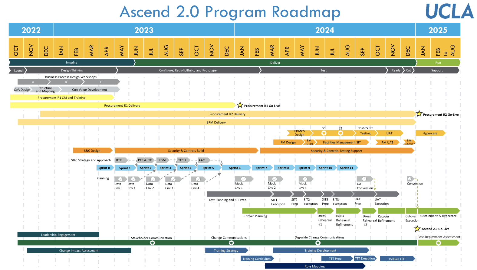
Ascend 2.0 is a multi-year initiative to re-imagine the landscape of UCLA’s financial systems. This newly updated system is modern, scalable, and cloud-based, which empowers staff with the up-to-the-minute data and robust reporting capabilities.


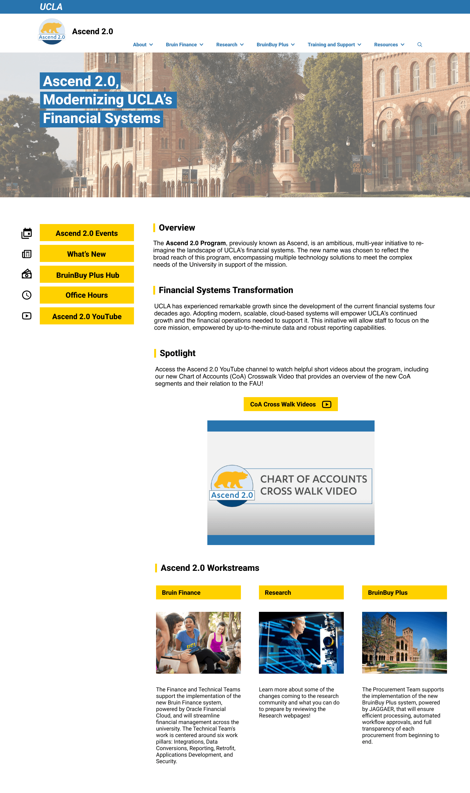
My task is to optimize the Ascend 2.0 website, where all information and training materials relating to the new financial systems are displayed.

The Problem

The Problem

How might we enhance the Ascend website's usability and accessibility to ensure that users can easily comprehend the content, navigate intuitively, and engage more effectively with the platform?

The Ascend 2.0 website serves over 17,000 UCLA staff, administration, and consultants. However, with no previous designer involved in building the website, the website needs some redesign to meet the needs of its target audience and increase its digital presence.This involves increasing content readability, improving user task success rates, and making navigation more intuitive to ensure users can efficiently find the information they need.

My Design Process

My Design Process

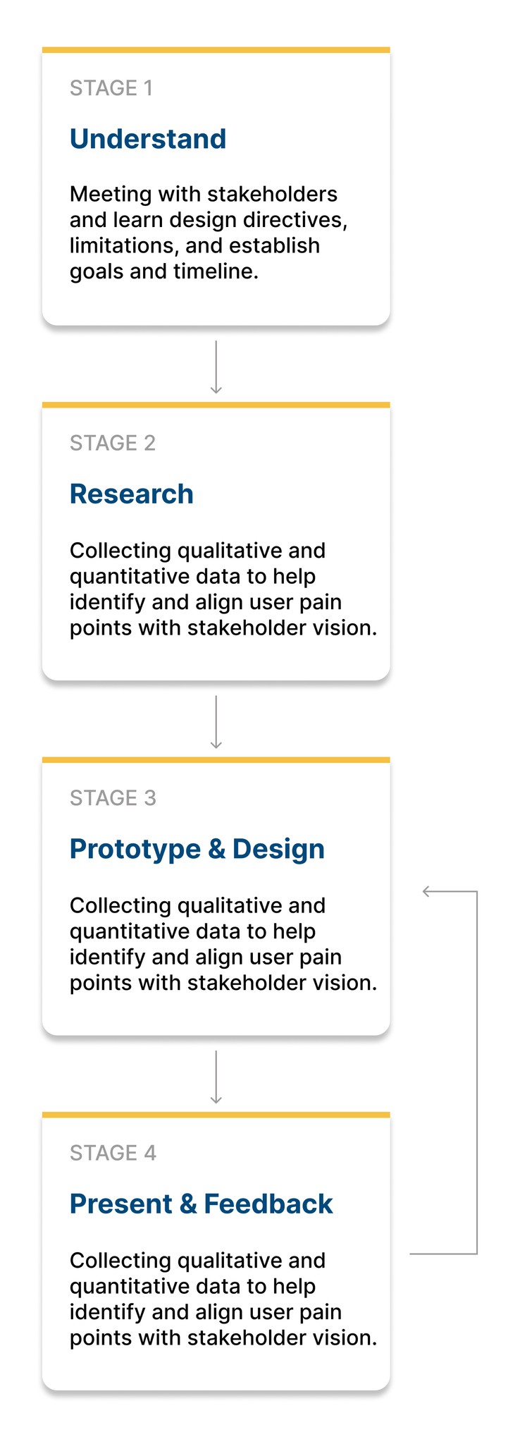
In my design approach, I actively engaged in design and IT team meetings and check in regularly with our stakeholders to foster constant feedback and iteration cycles. I aligned my design vision with our stakeholders’ goals while adhering to the UCLA design guidelines.

The Solution

The Solution

Removed secondary nav bar

Original secondary nav bar was rarely noticed and blended in with the upper page header. Users who did notice it reported feeling overwhelming with the navigation options.

Removed secondary nav bar

Original secondary nav bar was rarely noticed and blended in with the upper page header. Users who did notice it reported feeling overwhelming with the navigation options.

Removed secondary nav bar

Original secondary nav bar was rarely noticed and blended in with the upper page header. Users who did notice it reported feeling overwhelming with the navigation options.

01.

Research

Getting to Know Our Users -- Google Analytics

Getting to Know Our Users -- Google Analytics

I use Google Analytics data to identify the most frequently visited pages, pinpoint areas with high drop-off rates, and track repeated visits to specific sections of the Ascend 2.0 site. For example, users frequently visit the Contact Us page but often leave quickly, which could indicate confusing or unhelpful content. These observations guide the design of targeted tasks for the usability testing script, ensuring we address specific user pain points and improve site navigation and content clarity.

Usability Testing

Usability Testing

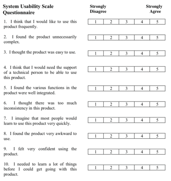
Based on our stakeholder’s vision and my observations from Google Analytics data, I created a 60-minute testing script that includes general demographics questions, 9 specific subtasks to complete on the Ascend 2.0 website, and some follow-up questions and Systems Usability Score (SUS) evaluation.

Methodology

I conducted 7 one-on-one qualitative interviews over zoom using the think-aloud method, and participants completed tasks while their behaviors were observed.

Ascend 2.0 Homepage Overview - general impression

Ascend 2.0 Homepage Overview - general impression

9 sub-tasks to complete on Ascend 2.0 website

9 sub-tasks to complete on Ascend 2.0 website

General follow-up & System Usability Scale (SUS) questions

General follow-up & System Usability Scale (SUS) questions

System Usability Scale Results

The average SUS score for the Ascend 2.0 website is 76.8, indicating an above-average usability performance (national average SUS score is 68).


This was reassuring to find, since it indicates the Ascend 2.0 website most likely won’t require significant high-level changes in website structure/navigation, which aligns with my stakeholder’s vision.

Main Usability Issues

ISSUE #1

Information Architecture

Issues regarding website’s overall structure, its organization. Some parts of the current navigation appears unintuitive to users, making it hard to discover and navigate to certain features.

ISSUE #1

Information Architecture

Issues regarding website’s overall structure, its organization. Some parts of the current navigation appears unintuitive to users, making it hard to discover and navigate to certain features.

ISSUE #1

Information Architecture

Issues regarding website’s overall structure, its organization. Some parts of the current navigation appears unintuitive to users, making it hard to discover and navigate to certain features.

ISSUE #2

Visual Cues/Signifiers

Issues with the lack of signifiers leading to confusions about possible ways to interact with website’s components. 

ISSUE #2

Visual Cues/Signifiers

Issues with the lack of signifiers leading to confusions about possible ways to interact with website’s components. 

ISSUE #2

Visual Cues/Signifiers

Issues with the lack of signifiers leading to confusions about possible ways to interact with website’s components. 

ISSUE #3

Unclear Wording & Layouts

Issues with confusing wording & layout patterns leads to misunderstanding of website’s content

ISSUE #3

Unclear Wording & Layouts

Issues with confusing wording & layout patterns leads to misunderstanding of website’s content

ISSUE #3

Unclear Wording & Layouts

Issues with confusing wording & layout patterns leads to misunderstanding of website’s content

Redundant Navigation to Hub

Users must make an extra click, landing on an empty filler page before accessing the main hub. This unnecessary step disrupts the flow and could be streamlined for efficiency.

Redundant Navigation to Hub

Users must make an extra click, landing on an empty filler page before accessing the main hub. This unnecessary step disrupts the flow and could be streamlined for efficiency.

Redundant Navigation to Hub

Users must make an extra click, landing on an empty filler page before accessing the main hub. This unnecessary step disrupts the flow and could be streamlined for efficiency.

Low Secondary Menu Visibility

The secondary navigation bar blends with the top banner and lacks visual cues, like arrows, to indicate clickable buttons. This makes it hard for users to notice and use the navigation bar.

Low Secondary Menu Visibility

The secondary navigation bar blends with the top banner and lacks visual cues, like arrows, to indicate clickable buttons. This makes it hard for users to notice and use the navigation bar.

Low Secondary Menu Visibility

The secondary navigation bar blends with the top banner and lacks visual cues, like arrows, to indicate clickable buttons. This makes it hard for users to notice and use the navigation bar.

Misleading Button Label

Users are confusing the labeling of a button to training materials, which is named after the platform where the materials are posted, instead of directly using the name of the training.

Misleading Button Label

Users are confusing the labeling of a button to training materials, which is named after the platform where the materials are posted, instead of directly using the name of the training.

Misleading Button Label

Users are confusing the labeling of a button to training materials, which is named after the platform where the materials are posted, instead of directly using the name of the training.

Counterintuitive Updates Access

Users struggle to find specific updates by navigating through dropdown menus instead of the designated updates page.

Counterintuitive Updates Access

Users struggle to find specific updates by navigating through dropdown menus instead of the designated updates page.

Counterintuitive Updates Access

Users struggle to find specific updates by navigating through dropdown menus instead of the designated updates page.

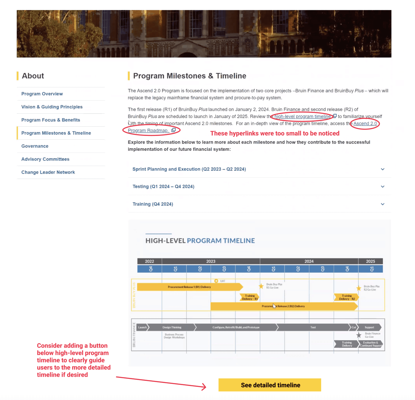
Inconspicuous Hyperlinks

Users struggled to find hyperlinked content due to small, easily overlooked hyperlinks embedded within large text paragraphs. This underscores the need for more prominent and clearly labeled links.

Inconspicuous Hyperlinks

Users struggled to find hyperlinked content due to small, easily overlooked hyperlinks embedded within large text paragraphs. This underscores the need for more prominent and clearly labeled links.

Inconspicuous Hyperlinks

Users struggled to find hyperlinked content due to small, easily overlooked hyperlinks embedded within large text paragraphs. This underscores the need for more prominent and clearly labeled links.

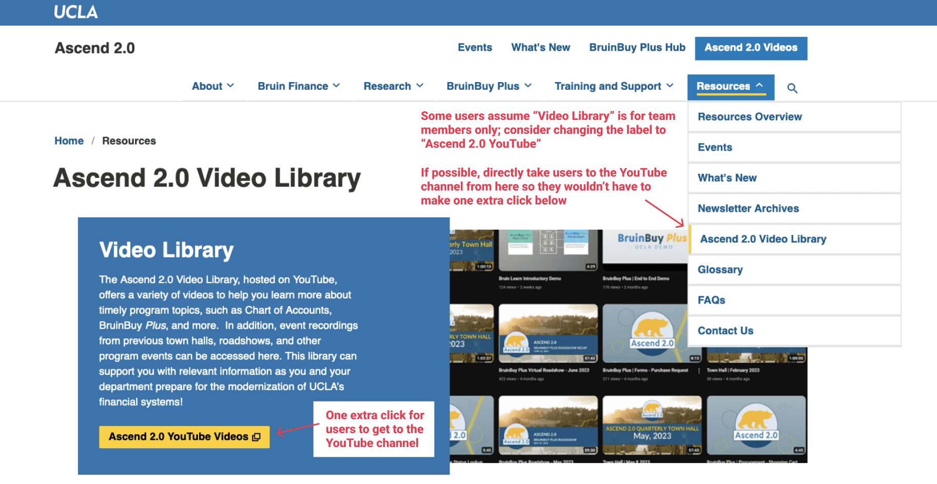
Misleading Video Library Label

Users misbelieve the "Video Library" is for internal team members and are unaware that the videos are hosted on YouTube for public access.

Misleading Video Library Label

Users misbelieve the "Video Library" is for internal team members and are unaware that the videos are hosted on YouTube for public access.

Misleading Video Library Label

Users misbelieve the "Video Library" is for internal team members and are unaware that the videos are hosted on YouTube for public access.

User Unawareness of Office Hours

The office hours information is not prominently or intuitively placed and is often overlooked. Consequently, many users choose to email team members directly rather than utilize office hours, which can create inefficiencies in seeking assistance.

User Unawareness of Office Hours

The office hours information is not prominently or intuitively placed and is often overlooked. Many users choose to email team members directly rather than utilize office hours, which can create inefficiencies in seeking assistance.

User Unawareness of Office Hours

The office hours information is not prominently or intuitively placed and is often overlooked. Consequently, many users choose to email team members directly rather than utilize office hours, which can create inefficiencies in seeking assistance.

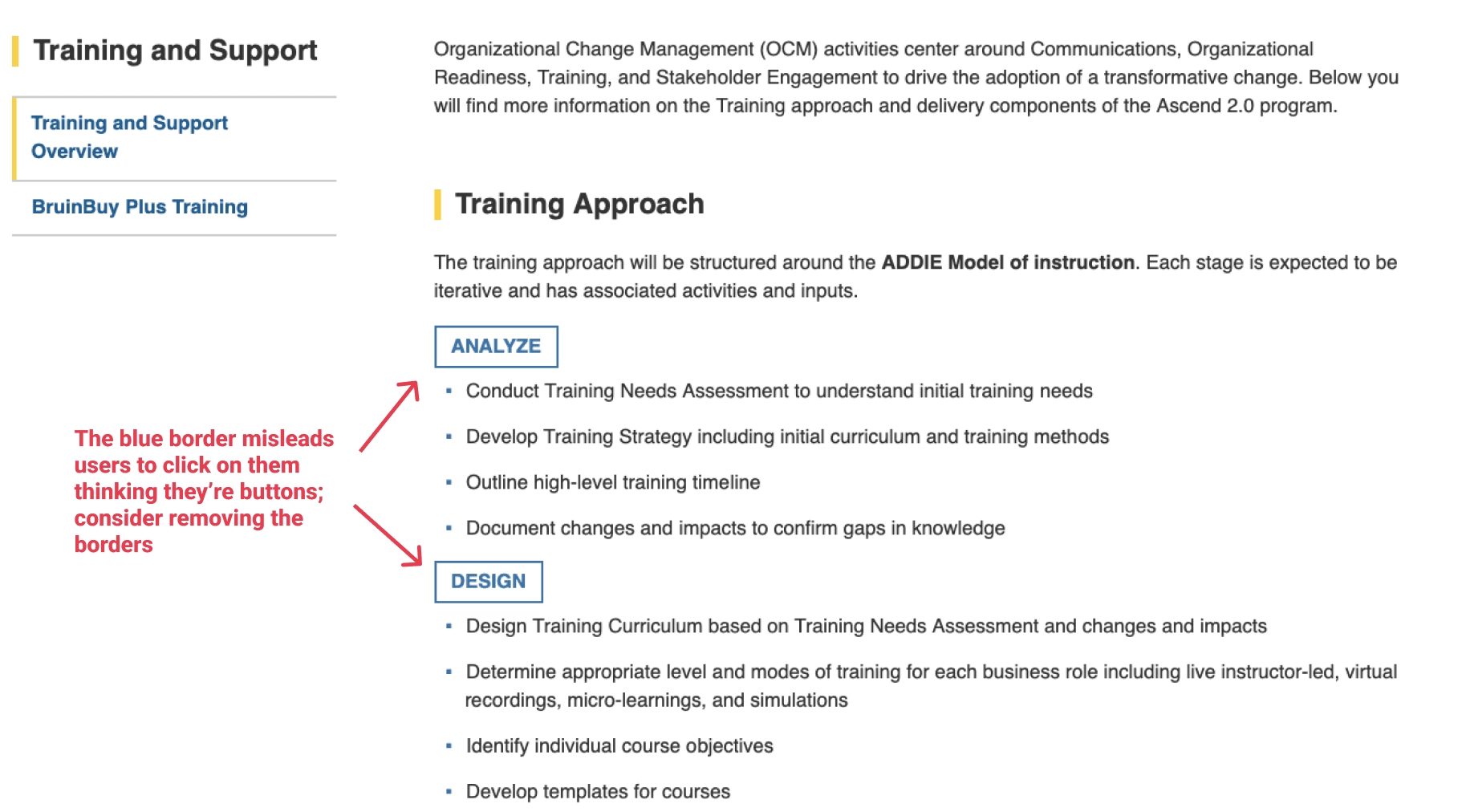
Misleading Clickable Indicators

Users mistook blue borders of text boxes for clickable buttons, causing confusion and attempts to interact with non-interactive elements.

Misleading Clickable Indicators

Users mistook blue borders of text boxes for clickable buttons, causing confusion and attempts to interact with non-interactive elements.

Misleading Clickable Indicators

Users mistook blue borders of text boxes for clickable buttons, causing confusion and attempts to interact with non-interactive elements.

Vague Events Page Title

The term "Events" is too vague, causing users to misunderstand its contents and harder to find relevant information, often assuming it refers to in-person activities rather than virtual office hours or town hall meetings.

Vague Events Page Title

The term "Events" is too vague, causing users to misunderstand its contents and harder to find relevant information, often assuming it refers to in-person activities rather than virtual office hours or town hall meetings.

Vague Events Page Title

The term "Events" is too vague, causing users to misunderstand its contents and harder to find relevant information, often assuming it refers to in-person activities rather than virtual office hours or town hall meetings.

02.

Ideation

Design Limitations & Project Constraints

Design Limitations & Project Constraints

LIMITATION #1

Website Structural Change

Since major structural changes to the homepage require UCLA administration's approval, my stakeholder prefers minimal structural changes and focuses on content rearrangement.

LIMITATION #2

Drupal Management System

The Ascend website, built on Drupal, has predefined templates and a rigid structure, restricting customization and making significant design changes difficult without extensive development work.

LIMITATION #3

Accessibility Concerns

We aim to create accessible content for all users. Therefore, the use of some visual elements such as infographics should be minimized. All elements on screen should be able to be processed by screen readers.

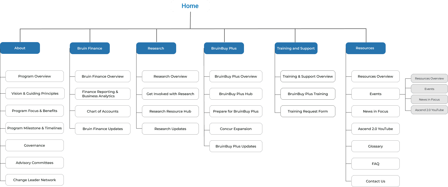
Information Architecture (Site Map)

Information Architecture (Site Map)

UCLA Design System

UCLA Design System

1 Color Palette

1 Color Palette

1 Color Palette

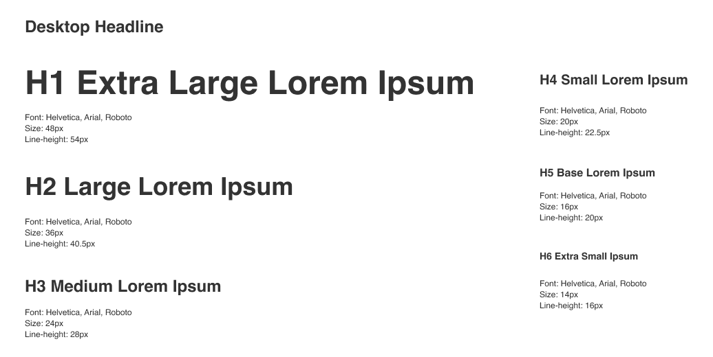
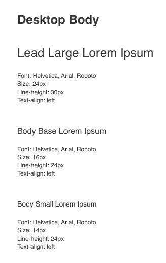
2 Typography

2 Typography

2 Typography

3 Iconography

3 Iconography

3 Iconography

03.

Design

Following my research insights, I created mockups implementing my proposed solutions.

Navigation Redesign

Navigation Redesign

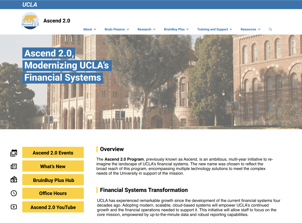
Old Navigation: Primary & secondary menus

Secondary menu blends in with header & frequently ignored

Lack of clickable signifiers (e.g. downward facing arrows)

New Navigation: Primary & side menus

Side navigation highlights key pages stakeholders would like to direct traffic to

Prominent yellow buttons clearly indicates clickability & captures user attention

Content Organization

Content Organization

  • reorganize contents under updated information architecture, making navigation more intuitive

  • reorder information on webpages, placing most frequently used, public-facing content before rare, internal-use contents

Targeted Updates Content

Update info for each workstreams are now also available under each of their subsections, in addition to the overarching Ascend 2.0 “What’s New” update page

Users get to learn about specific updates for each of Ascend’s subcategory easily

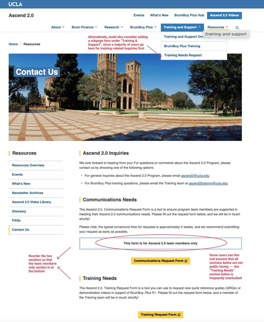
Demo Training Request Form

2 potential improvements were provided, and the stakeholders were suggested to go with the one with least administrative approval and development efforts needed.

Reorganize navigation: place the form under a new subpage called “Request Demo Training” under “Training and Support” section


Reorder subsections: on the original “Contact Us” page, switch the order of “Communications” and “Training Request”, so the internal-only section is at the bottom, running no risk of

Improved Signifiers & Visual Cues

Improved Signifiers

& Visual Cues

redesign elements to improve salience and increase amount of attention gathered from users

Prominent Button for Detailed Timeline

The previous hyperlinks were too small & deeply buried within texts

The added yellow “See detailed timeline” button is prominent, quickly captures user’s attention, and conveys its purpose clearly with straightforward wording

The proximity of the button to the high-level timeline will naturally guide users to the detailed timeline after reading a general overview

Remove Title Border to Avoid Confusion with Buttons

Rewording of Misleading/Confusing Phrases

Rewording of Misleading/Confusing Phrases

reword confusing phrases on buttons/page titles into straightforward, descriptive phrases

“Ascend 2.0 Video Archive” --> “Ascend 2.0 Youtube”

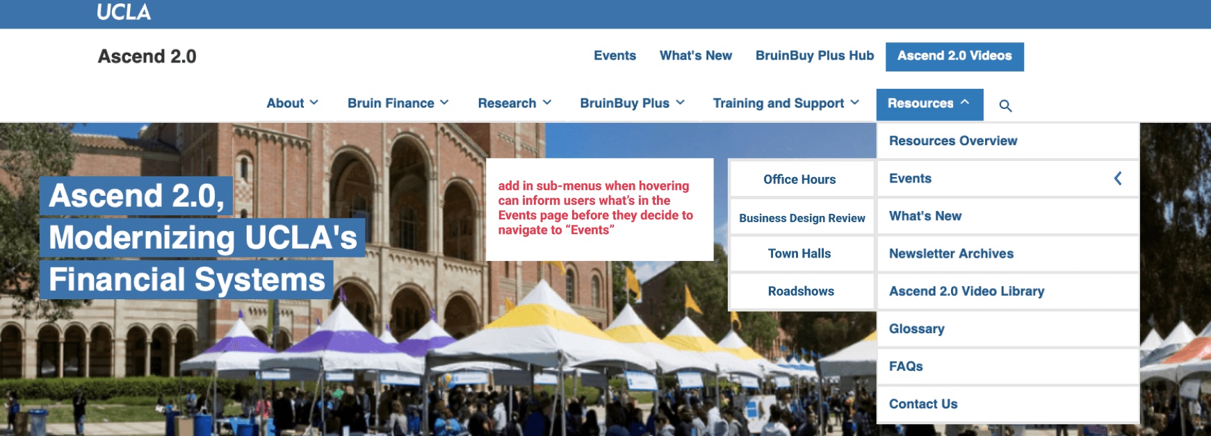
“Events” Sub-menus

The original page title “Event” is too vague; users are unsure what’s on the page

Adding hover-to-show sub-menus under “Events” in the navigation bar so users know what content to expect

04.

Reflection

Main Challenge & Key Takeaways

Main Challenge & Key Takeaways

One of the main challenges of this project was managing the fast-paced nature of the work. The website's layouts and content were frequently updated, requiring me to constantly revise tasks and testing scripts to ensure they remained relevant and aligned with the latest changes. This iterative process demanded flexibility and quick adaptation, as each update could impact the usability testing and overall project direction.


Another significant challenge was navigating the administrative processes. Many aspects of the project required approval from various stakeholders, which often involved long wait times. These delays had to be factored into the project planning, making it crucial to anticipate potential bottlenecks and adjust timelines accordingly. Balancing the need for thorough testing and rapid iteration with the administrative constraints was a key learning experience in project management and stakeholder coordination.